Bring consistency to images and make onboarding easier with a Style Guide. In this blog we take you from the basic questions about a Style Guide to a detailed template in which you can immediately start creating your own Style Guide (or improving your current version).
1. What is a Style Guide?
2. Why use a Style Guide?
3. What should you not forget when drawing up a Style Guide?
3.1 Define the workflow
3.2 Exposure photo shoot
3.3 Product Photography Guidelines
3.4 Guidelines per product category
3.5 Using file names
3.6 Post-processing
4. Download: Style Guide Template
1. What is a Style Guide?
If you are still completely unfamiliar with the term, it is good to start with the basic question: “What is a Style Guide?”. A Style Guide is a document that is often drawn up by Fashion companies . The Style Guide defines all variables within an entire process. Often different types of Style Guides are drawn up per link within the entire process. In this blog we zoom in on the Style Guide, which can be used as a guide when photographing images.
The result of a clear Style Guide ensures consistency in the E-commerce images.
In this blog we walk through the steps and chapters of a Style Guide together. Ultimately, this provides more guidance in the entire process and you can fill in the free template yourself or compare it with your current Style Guide.
2. Why use a Style Guide?
With a Style Guide you create a documentation that you can use for years with every product shoot. Everyone involved knows what is expected during a photography session. When you start with a new way of photographing content, a Style Guide is the basis. This provides a basis for reaching the desired final image as efficiently as possible.
It is discussed briefly in the previous paragraph. A Style Guide ensures an easy transfer of information when you work with multiple photographers or external parties. Onboarding new people or companies is easier, faster and more efficient. For example, when you have a new photographer take pictures, you only need to briefly read the Style Guide. The photographer can get started immediately according to the guidelines in the Style Guide. This reduces the chance of inconsistencies and loss of time.
The difference is in the details, especially when we look at fashion brands. Consistency creates a professional look and strengthens the brand. A Style Guide is a must have for this.
3. What should you not forget when drawing up a Style Guide?
When you start working with a Style Guide, there are a number of chapters that should definitely be included in it. These chapters are the common thread of the document. Don’t forget that you can always add chapters yourself for a more detailed document.
- Your studio’s workflow
- Lighting at the photo shoot
- Product photography guidelines
- Guidelines per product category
- Using file names
- Post-processing
In the following chapters of this blog, we will cover each part through an explanation and some examples.
3.1 Define the workflow
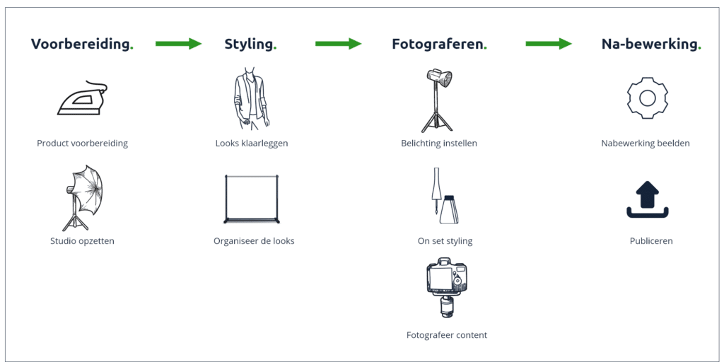
In order to get a good picture of all the links within the entire process, it is good to write out the workflow. When the workflow has been written out, it quickly becomes clear who is responsible for what step in which step. Below is a sketch of a workflow to give you an idea. Work these out for yourself later in the work file.
3.2 Exposure photo shoot
Creating an exposure chart ensures that you maintain consistency in the lighting of your shoots. Even when the layout changes in the meantime or a new photographer starts working.
The exposure diagram can be divided into two parts:
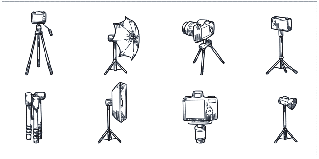
1. Write out a list of materials you have at your disposal.
In this section it is important to write down all the elements that you have available in the studio. Don’t forget to include secondary materials, such as chairs, benches, etc. If you have a lot of materials and some of them are similar, it can be useful to code all equipment by numbers and/or codes. These codes can be added to the list in combination with a name and image. The code is stickered on the material. This method works well with large and widely varying teams.
2. Place the materials in position
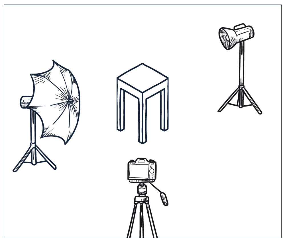
When you have prepared a complete list of materials, you can proceed to this step. Here you make different drawings (2D) with the arrangement of materials per content style. Some materials can be adjusted in height/width, so it is important to also specify height and/or width with these adjustable materials. The moment you have made the drawing with materials, it is useful to place one model shoot in it. This clarifies the drawing with a previously photographed image in this arrangement.
3.3 Product Photography Guidelines
When the workflow is clear and the different exposure diagrams are clear, we can create general guidelines. It is good to distinguish between general guidelines for photography and guidelines per category (next chapter). The general guidelines indicate which collections are photographed, which method is used to photograph and which types of images should be created. We can use the following checklist for this:

3.4 Guidelines per product category
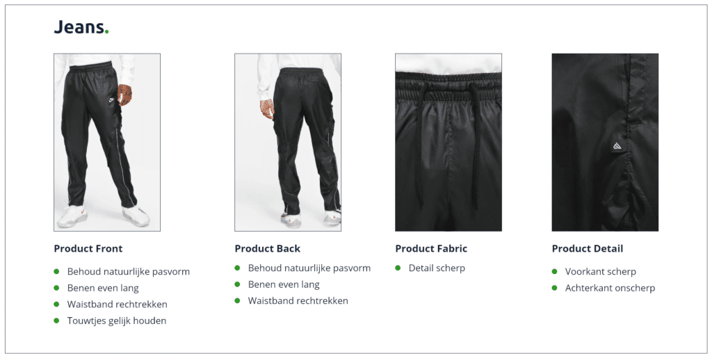
Within a Fashion line you almost always have to deal with different product categories. The easiest is to distinguish these in garments. This can be for example: jackets, sweaters, sweaters, t-shirts, pants, accessories and shoes. Before you start writing down the guidelines per product category, it is good to make a list of all categories.
When you have a clear list of product categories, it is easy to compile a list of shooting methods and final images. In the example below we work out the guidelines for the product category ‘jeans’.
3.5 Using file names
Now that we have determined the product photography guidelines in general and per product category, we often see that many different images come out. In order to work in a structured and transparent way for other departments (and for yourself ..) it is good to establish a file name structure and to always stick to it. In this way you can quickly and easily find out what product it is, from which line and what type of shoot it is based on a file name.
Standardizing file names depends on the organization. We often see that a number of elements almost always return. An example of a filename format could consist of the following parts:
- article number
- color code
- number
- product name
- color name
- type of image (front, back, side, detail, fabric, product front, product back)
As an example, we took a product called ‘example cap’ with the color ‘sage green (DB34)’, item number S1 and photographed it in two ways. Then the file names would look like this:
S1-DB34-01-example-cap-sagegreen_detail
S1-DB34-01-example-cap-sagegreen_product-front
3.6 Post-processing
When the main points in product photography are determined in which ways articles are photographed, the corresponding post-processing is also determined almost immediately. For the best end result, post-processing is always necessary, only this type of editing differs per photography method.
In the previous chapter we gave structure to the names, in the last variable of the file name we indicated the type of image. This last part of the file name gives you a good handle for post-processing in this step. It is good to make a list of essential post-processing per photography method (type of image). The advantage of this is that you do not have to think about and write out after each photography session which post-processing needs to be done. You also maintain efficiency and consistency when the post-processing is defined per image.
In addition to post-processing, it is also efficient to have the images exported directly by the image editor (mainly for Ecommerce images). As a result, marketing can immediately start working with the images and it saves a lot of time in downloading/uploading images.
Below we give an example of a detailed post-processing for a product detail image:
Product details:
Editing:
– make it detached: Yes
– background color: #D7D7D7
– white space: 5% (top, right, bottom, left)
– retouch: make symmetrical, remove dust, remove imperfections, remove wrinkles
Export:
– file extension: .jpg
– compression: LZW
– filename: (suffix) _ED
– resolution: 300 dpi
– color representation: sRGB
This greatly reduces the chance of errors or inconsistency. The image editor knows exactly which image is involved by the file name and predefined editing/exporting operations. When the image is ready, it will have _ED after the file name (in this example). So that everyone can quickly see that it concerns the final Ecommerce production image.
4. Download: Style Guide Template
Hopefully we have given you a better idea of a Style Guide in this blog. In the previous chapters we have covered all the theory of the Style Guide. To make this theory applicable within the organization in which you work, we have created a template (workbook). In this document you can create your own Style Guide based on the parts discussed earlier. If you already work with a Style Guide, you can also use our workbook to optimize it, check it or gain new insights.


